Web Design: Moving DIGI
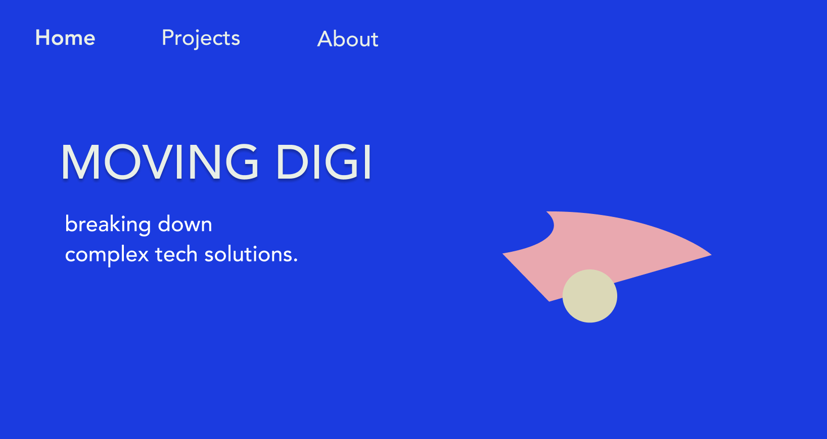
Moving DIGI wanted a simple, modern look for their website, and explicitly asked for this beautiful, bold, blue as their background. I created a fitting color profile with this bold blue in mind.
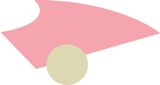
I created this logo for them, combining perfect and imperfect shapes to symbolize the dichotomy of their work.

The Homepage was made with a simple headline, logo, side navigation bar. The client also asked for short tagline.
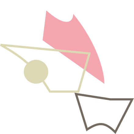
The client asked that I created some graphic elements, that symbolizes a process - something morphing from chaos to order, the coming together of ideas creating a concept. So i made some shapes into an animation, showing elements falling into place.
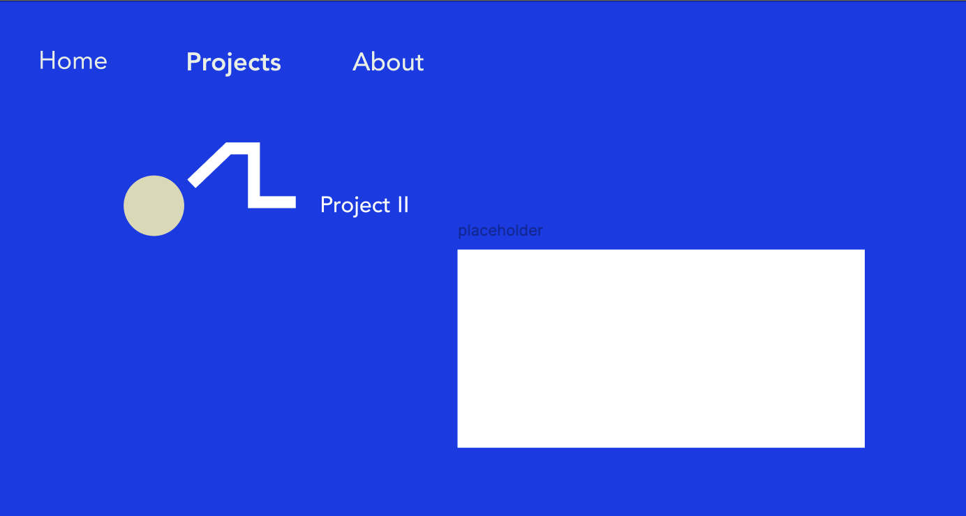
Moving DIGI wanted to showcase their projects, so I continued using geometrical shapes creating lines and dots that leads the user to the different projects shown.